BEST COFFEE TABLE BOOKS FOR MINIMALIST HOMES
[This post contains affiliate links!]
Somebody on Instagram asked me ages ago for a little round-up of the best coffee table books for styling up their home, so I thought I’d finally get around to doing one.
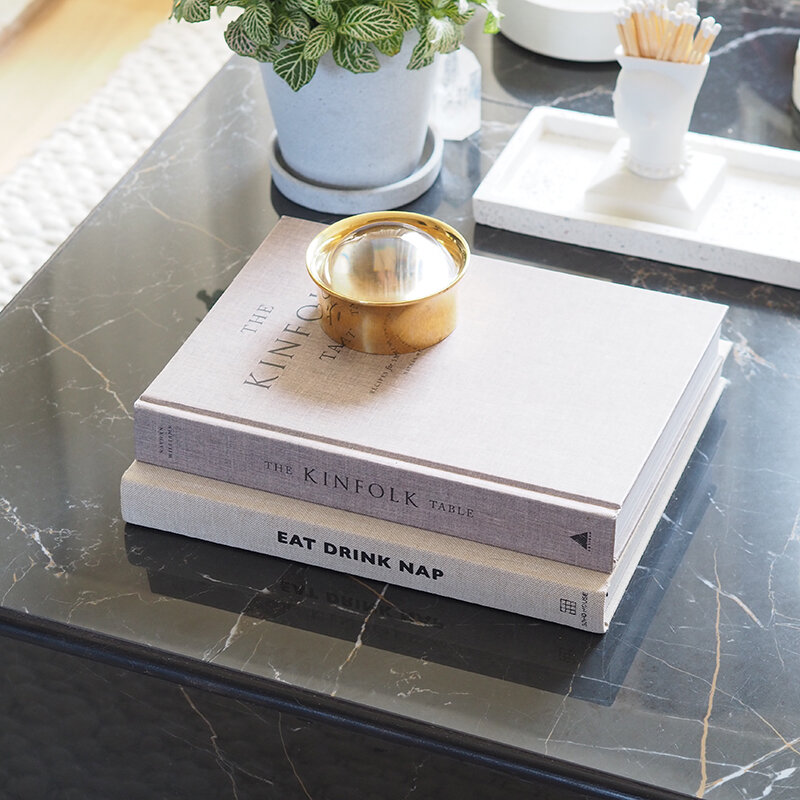
However, it got me to thinking – while I do buy a lot of interiors-y, hardback, coffee table-appropriate books, I also move the same 4 or 5 books around my house when I need to style a picture. It comes down to the hard facts that some books are better styling props than others.
That doesn’t always mean those other books don’t have beautiful covers in their own rights, however, when you have a coffee table book on such prominent display, the colours and size play a very important part in how the overall scheme hangs together.
With that in mind, here’s my quick guide for getting it right in a neutral-loving, minimalist home.
HARDBACK AND PAPER WRAPS
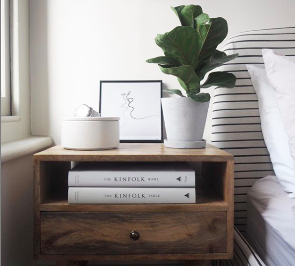
Hardbacks work best for me for coffee tables in particular. The books themselves are a bit more hardy, which means that you can still use your coffee table without fear of damaging any books left on display. If a hardback book comes with a paper wrap that you like the look of, make sure you also like the cover underneath the wrap. I bought a few of the Kinfolk Home books, but the paper wraps started to get a little tatty, so I took them off. Great for the ones that just happened to match my scheme, but I had a mint green situation to contend with too that didn’t work so much for me.
TEXT AND IMAGES
A beautiful photo on the front of a book can be a great thing, but think about it in context of where you’re placing it. A photo of an interiors can be quite busy – think about Elle Decorations subscriber issues which are close-up, simplified shots, meant more for coffee-table appeal. Look for coffee table books that are pared back, and even just with text where possible, to give you a near-blank canvas to play with.
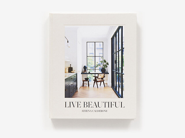
If you do look for a book with an image on the front, one with minimal contrast between colours can help it to be less dominant in your overall scheme - see Live Beautiful below for an idea of how this might look.
TEXTURE
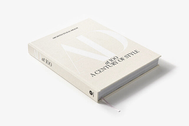
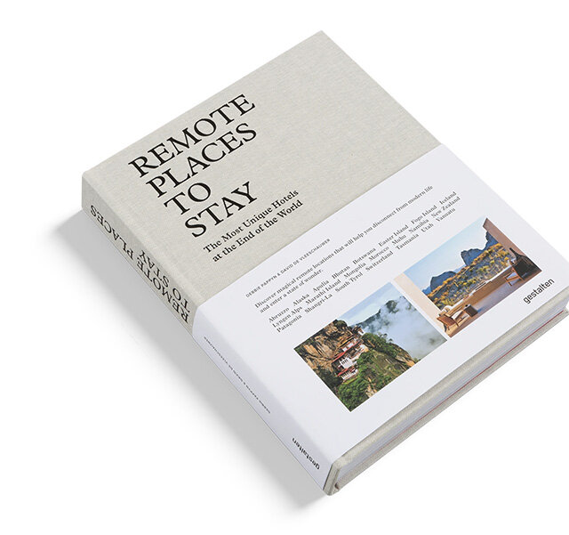
For those blank books, you’ll want to consider texture to retain some interest. Fabric covered books have natural depth and photograph well, and they’ll also better take knocks and dents that flat, textureless hardbacks. Raised or impressed text is another way to bring texture to your coffee table.
SIZE
Size is another thing to consider as part of the visual noise created by book styling. I tend to lean more towards stacking books of identical sizes, which is where series books such as Soho Home and Kinfolk come in handy, otherwise you’re leaving it up to fate to find books in sizes that stack well together.
five of the best coffee table books for neutral, minimalist homes
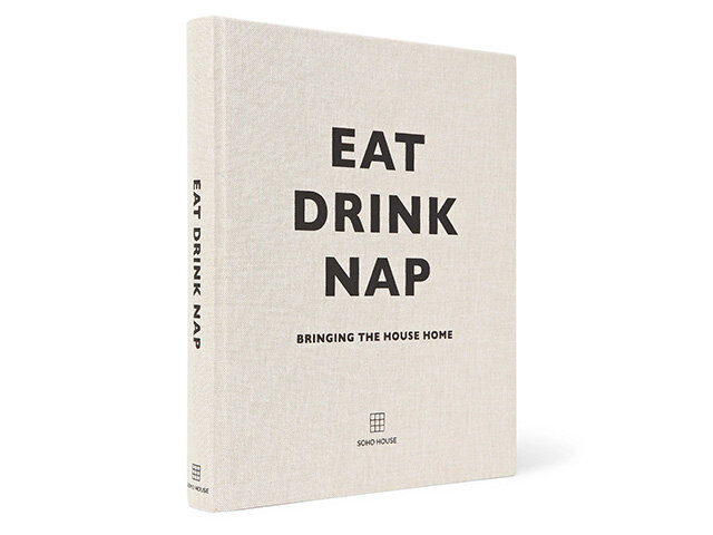
EAT, DRINK, NAP - SOHO HOUSE
Got any other coffee table favourites to suggest? Drop them in the comments below…

