KITCHEN MOODBOARD: COLOURS, FINISHES + MORE
I’ve whipped up a quick moodboard for my kitchen renovation project - want to see the cabinets, handles and tiles I’ve picked? Read on..
(This post is part of an ongoing collaboration with Magnet Kitchens)
Things are moving along nicely with my kitchen renovation project, but I realised that while I’ve shown you my kitchen layout plans, I’ve not shared any details about the colour or finishes I’ve chosen for the space. I always like to create a moodboard when I’m working on an interiors project, but not in the way that I’m actually sticking things down to a piece of board. It’s just good practice to have all your samples together so you can see how the colours and textures interact.
When it comes to kitchen design, this has always been a bit of a challenge. Unless you’re having a kitchen colour matched to an existing paint colour, for example, kitchen companies don’t always have realistic samples of their cabinetry colours and finishes that you can take away to see in your own home. Colour can shift so much depending on the light. When ordering our kitchen, we spent hours in the showroom comparing two very similar shades, taking them close to the windows to see what they looked like in different kinds of light. Having samples really just takes the guesswork out of it.
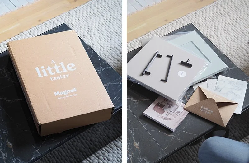
As you might remember, I’m working with Magnet on my kitchen project, and so I was super excited to see that they’ve started offering a sample kit with large door samples, handles and worktop ideas.
It’s like a readymade moodboard in a box, but obviously I’ve got tiles, flooring and all that other stuff that I’ve sourced myself to add into it that will really help see how the scheme is going to come together.
Recently, I’ve been pinning lots of work by an interior stylist called Amanda Rodriguez, who creates these visual moodboards as still lives, and have been thinking that given that I’m photographing it anyway to show to you all, why do I need to be constrained to presenting a moodboard as a flatlay? We’re going 3D with these moodboards?
Want to see the vibe I’m bringing to my new kitchen?
I mentioned in my other blog post that I’ve opted for the Magnet’s Soho range - a flat, slab door style. When I first went to the showroom, I picked the Cashmere colour, but once I got my sample box at home, it was clear that this Truffle Oil shade was better suited to the space, which really brings out the warm tones, making it the perfect dark taupe I was looking for.
I’d already picked out my favourite handles when I visited the Magnet showroom in Chelmsford, this black hexagonal style - simple, but dramatic.
Worktop-wise, I already knew I wanted a white worktop, just to bounce around as much light as possible from the kitchen window at the back of the house. I found this Antartica Corian in the Magnet showroom which I absolutely love. It’s got a really subtle patterning to it which means it’s almost as white as can be, but also means you won’t notice every little mark and drip on the worktop all day.
As well as the black finishes in the handles, window and door, I’ve got some classic stainless steel appliances in the space. I’m keeping my range cooker, and I’ve chosen a Quooker tap to match. There’s something classical and industrial I do love about a good stainless steel finish.
I’ve already laid an amazing reclaimed brick floor in for the kitchen to sit on - it’s a pale, light brick that will make a nice contrast to the slightly darker cabinets. I’ve also found some brand new ridged tiles for the walls that I’m going to use on the wall behind the hob, bringing in some texture to add some excitement to what is quite a neutral scheme.
The walls will be painted the same colour as my living room - a very light beige colour, as it’s now an open-plan space having knocked through the walls between.
For anyone who can’t visualise from my conceptual 3D moodboard, I did of course shoot a flatlay too. This brings in some of the darker accent tones of the accessories. Staying in a neutral theme, this includes wood, natural stone and darker brown hues.
I’m so excited to pull this scheme together now, especially finishing it off with the styling. Plus, I’ve got the peace of mind now that I’ve seen the cabinetry colour in my space and I just know it’s going to look amazing once it’s all fitted.
All being well, I should be ready to show you the final kitchen by the end of the month!


