I'M LIVING FOR KYLIE JENNER'S HOUSE IN AD
Okay, I’m a bit of a Kardashians fan, but before you block and delete me forever, I promise I’m not going to talk about them on this blog… unless it’s interiors related.
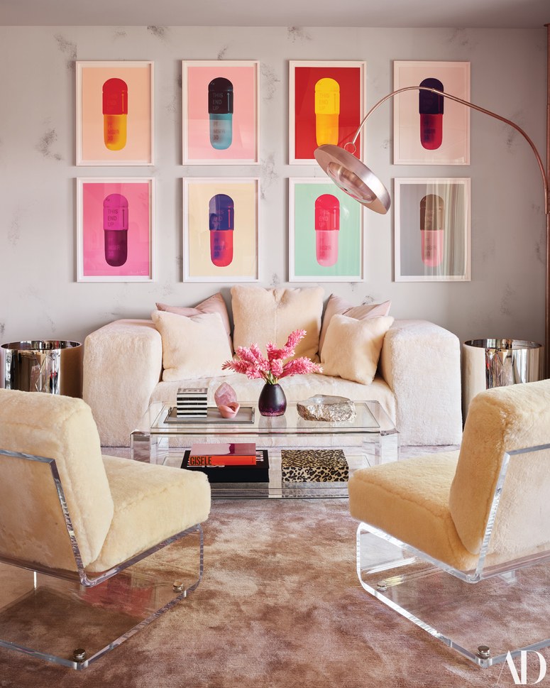
Good for me then that Kylie Jenner was featured in this month’s Architectural Digest! I spotted the pictures of her newest home online and something about the design really struck a chord with me. If you flick through them on the Architectural Digest blog, it’s easy to get distracted by some of the more outlandish features - the enormous American mansion proportions and over the top ‘glam’ room for example, but for me there were some real style takeaways from some of the spaces.
Architectural Digest
Recently, I’ve been having an adverse reaction to colour in interiors. They’re undeniably what’s big at the moment, but I get a little bit annoyed when people say that you’re not being wild enough if you don’t go crazy with colour, and don’t get me started on the ‘anti-beige’, ‘beige is boring’ narrative.. I swear when I read someone say that it’s one of my biggest turn-offs!
It’s the sort of thing that makes people make choices that actually they’re not very comfortable with. I learned pretty quickly that some people don’t want colour in their home not because they’re scared of it and that they want something ‘timeless’, but actually because they just don’t like it. I’ve got to say, almost any time I’ve painted a room in a bolder colour, it’s actually stressed me out living in it. It objectively looked great, but I just don’t get a great feeling from it - weird, right?
Architectural Digest
I think that too all the spaces I’ve seen of late, this design, created by Martyn Lawrence-Bullard for Kylie’s home, is the first steps to curing my current colour phobia. At heart, it’s a neutral scheme, rich in texture, dressed up with colour palette that is all at once riotous, refined and effortless. It has a sort of Jonathan Adler playfulness about it too, which I really do love.
When I posted this on Instagram, someone (helpfully) pointed out that this isn’t that bold - it’s some coloured accessories in a beige room. But this is my level of bold - colour that adds substance, but that isn’t a gimmick.
Anyway, the curves, the colours - basically I’m here for it all. And while I’m not giving up on showing you can do something exciting and fresh with a neutral palette, I think when I come to finish off my living room, I might give it a refresh with a little twist of Kylie Jenner inspiration..


